I was playing with marketing and design yesterday, doing some research on how to organically grow your Instagram followers. One strategy that kept coming up, was make your "page" visually appealing, keep it consistent with your BRAND colours. Do your images represent the MESSAGE you want to convey? There were many examples of gorgeous looking feeds, beautiful colour palettes, some were just collections of objects in one colour, very minimal and very structured, the most fascinating to me though, were the ones which required careful image selection, and planning on a larger scale...where you needed to go to the account itself to see the full effect of the 6-9 or 12 individual images...the bigger picture. I could see how this layout would garner followers, they would want to see what the puzzle looked like when it was finished. This was something I was interested in trying....
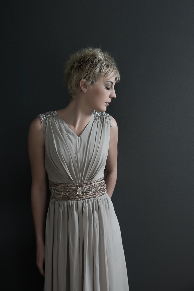
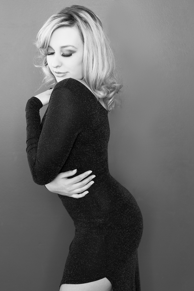
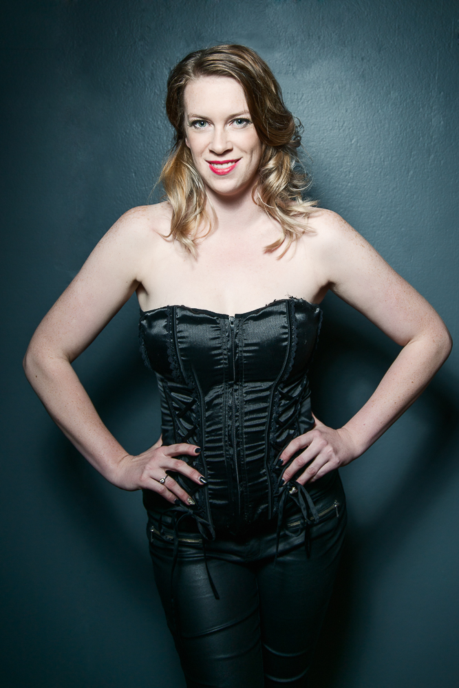
It was a cold dreary rainy Melbourne Monday, so I searched the internet and found some beautiful images of objects that were pretty to look at, made me happy (yes there is a camera in there) and were somewhat relevant to what I do. I decided to design an Insta grid…it took about 10 minutes to make a layout in photoshop that was cohesive and would make sense (more or less) as individual images. A 15 image grid, I could post 3 images a day for 5 days, with cutesy little phrases….surely…. and at the end a pretty little grid that would beautify my feed. (see my creative layout below)
That’s when I decided to go to my instagram account and have a look at what my "brand" was portrayed as…hmm to say the least it was eclectic. A random jumbled mess of behind the scenes videos, adventures, published images, my kids, what I cooked for dinner, sunsets, the occasional quote, friends and funny moments. It was at this point I realised, I was never going to have a beautifully organised and planned feed, with a serene colour palatte, harmonious images that complimented my message and branding. A feed full of pretty photos which may or may not have anything to do with my life or business, (but they looked good and were the right colour)…..Although those accounts are gorgeous to look at and I admire the skill and dedication in attaining the visual holy grail of instagram style and allure…. It's just not me. I could of course clean up my feed, just post relevant photos, or I could separate my accounts, one for photography and the other for everything else. But that wouldn’t be a realistic representation either.
My photography is not just my business, it is a part of who I am, just as my family and friends are. So I apologise to those who follow me for my photography and then see random images of vegies out of my garden or my childrens latest accomplishments. My feed looks like an unplanned, designless assemblage of images…because it is… and that pretty much represents the way we live our life and enjoy it.
My pretty little Insta-grid


